An array of disparate photographs on a camera phone. Strange lines on a road, a stack of junk on the edge of a sidewalk, a vague and unclear object filmed at night. These images are the inspiration behind, perhaps, one of Japan’s most promising and acclaimed architects. Slight of build, with an unkempt beard, gregarious, often very funny, but when faced with questions about his work, serious and profound. This isn’t a hobby. This is life, this is why he keeps on going, this is why he’s been namechecked by several of my architect friends as one of the best in Japan.
I meet Yusuke Seki near his Tokyo office in Gakugeidaigaku. His main space is in Kyoto (he also works from Kobe) but he travels to Tokyo often and is working on a new project as we speak, a flagship store for one of Japan’s leading fashion brands. He’s not allowed to discuss it, at the time of writing, but I know the name of the brand and the project is huge for such a young architect. Seki, however, doesn’t particularly like being labeled as an architect or a designer or a creative, he is quite simply “Seki.”
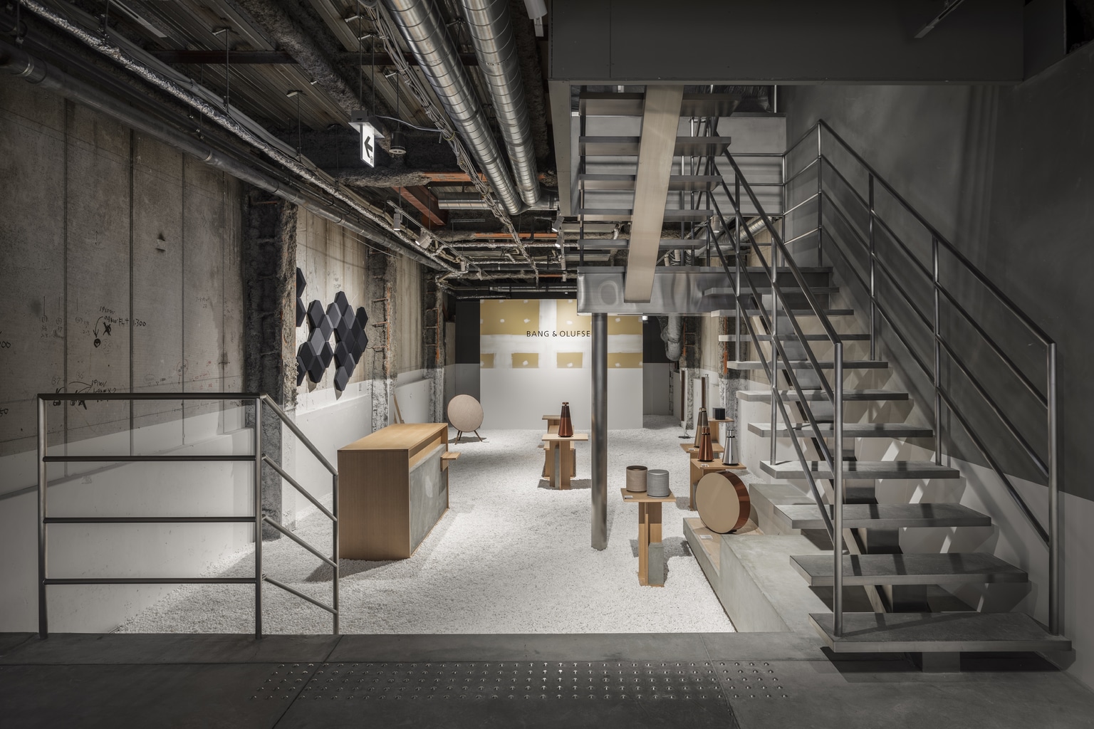
It becomes apparent, early in the interview, that he shares many similar ideals to Comme des Garçons designer and visionary Rei Kawakubo. Wabi-sabi and finding beauty in imperfection is very much his style and if you inspect his work, you can see traces of this from unfinished details in the Adidas Originals flagship store in the capital to the unfinished and rough concrete exposed at Mikkeller Tokyo beer bar in Shibuya.
In some ways it’s no surprise Seki became an architect. He was a high school student when the devastating Great Hanshin earthquake struck his hometown of Kobe. For weeks after that fateful day on January 17, 1995, he rode his bicycle around the city witnessing first-hand the carnage and terror which ignited something in him, a wish and desire to rebuild, to construct a city in his own style. It was a bold and ambitious intention but Seki’s journey as an artist and creator began that very day.
As we talk about his work over a coffee, I think of what the great abstract expressionist painter Willem de Kooning said of his peer Jackson Pollock. “Every so often, a painter has to destroy painting. Cézanne did it, Picasso did it with Cubism. Then Pollock did it. He busted our idea of a picture all to hell. Then there could be new paintings again.”
There’s something about Seki’s work that alludes to starting from the beginning and rethinking. It becomes like a complete and actualized destruction of architecture and space. If you look at his work for Voice of Coffee, a coffee roaster and café in Kobe, it looks like, at first glance, it’s under some kind of construction.
“Untreated concrete walls, exposed air ducts and an unfinished drop ceiling momentarily makes you think that the barista working behind the counter should be plastering walls or installing ceiling tiles instead,” writes Stuart Taylor for Papersky magazine.
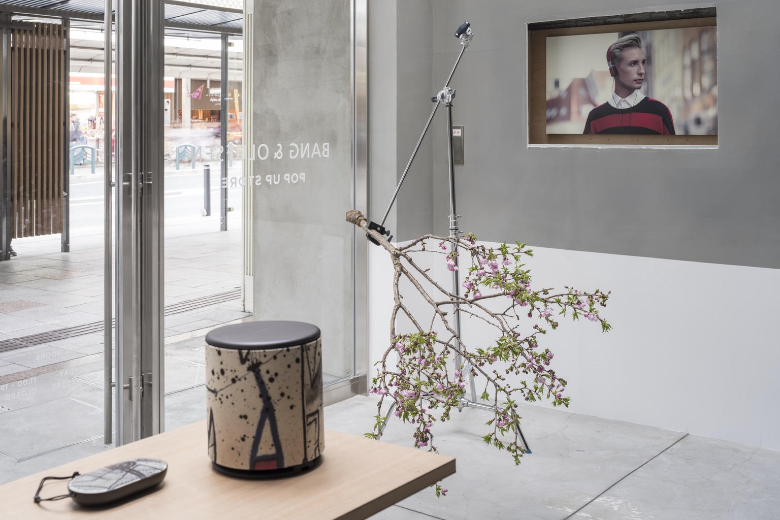
Seki mentions to me in our interview that, essentially, his intention is “to expose the spatial relationship with time. Showing its previous incarnations and uses. Every building has a story, its own narrative which is laid open for all to see and appreciate.”
Seki’s body of work then plays on the idea of spatial palimpsests, where the viewer can explore the space’s past, its former functionality and its history while simultaneously appreciating the present and perhaps even the future. He likes to view his projects as unfinished, always ongoing.
Although the work of the Kobe native might sound postmodern and achingly hip, and it probably is, it is also infused with a great sense of theater and, dare I say it, fun. I ask him about the theatricality and drama involved with his projects.
“It’s like a set design,” he says about his work for the Maruhiro flagship store in Nagasaki Prefecture. “You could compare it to traditional Japanese culture and theater. It’s architecture but it’s also space, similar to a theater space where people can enter the stage and interact.”
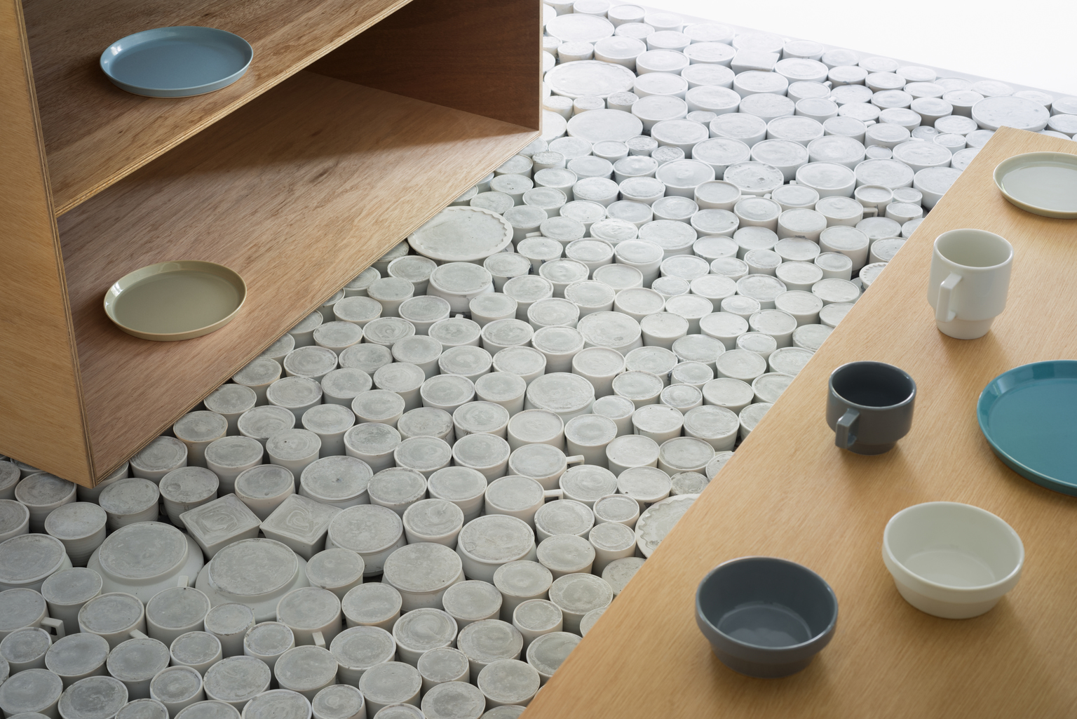
Maruhiro is a leading producer of Hasami ceramics which includes pottery and porcelain. The centerpiece of the store is a raised stage which comprises 25,000 pieces of unused and imperfect ceramic bowls and cups, which he has made safe to stand on.
A similar mise-en-scène can be found at the Bake Cheese Tart store in Kyoto which has a black and gray counter space, resting on a simple wood and cement base. This was created from a myriad of millions of Lego blocks. The pieces of Lego act as a functional use but also as a mischievous statement of intent, as a symbol that design can also be smiled at and be seen as an object of fun and enjoyment.
When you dig deeper, which the works of Seki ask you to, you see a parallel with the theory of the legendary English and Paris-based theater director Peter Brook who wrote the seminal treatise on theater The Empty Space in 1968. Brook wrote that, in very simple terms, everything is in fact an act of theater. From fashion shows to a single human walking across Hachiko Crossing, every act that we experience is theater. And with that concept in mind, every space that Seki has designed and will design is a theatrical space.
With his new projects, including the fashion brand flagship which is sure to be his major professional calling card, Seki aims to reconstruct and destroy previous notions of the true nature of architecture.
It is, however, with Kumu Kanazawa, a hotel situated in Kanazawa, that Seki really burst into international design consciousness and began to shatter ideas of spatial design. It concludes with the owner of the hotel using Seki’s design concept as the name for the space itself.
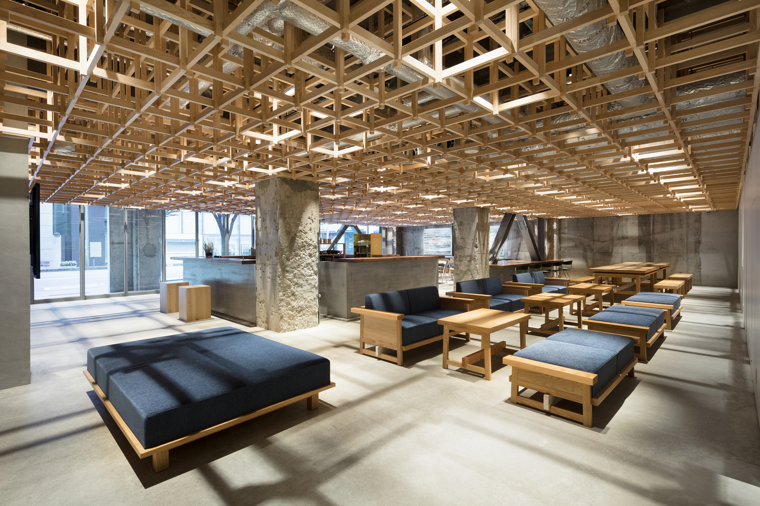
The verb “kumu” has an array of nuances in Japanese which include “to join,” “to pour” and “to draw out” which are all incorporated into the hotel’s design. Visitors are encouraged to join the space, empathize with others through drawing out and understanding each other and encourage the spirit of Japanese omotenashi by pouring a drink for a fellow guest. So, in essence, a verb becomes a concept, a way of viewing and a method to participate in a space. According to the Yusuke Seki Design Studio official statement regarding Kumu Kanazawa:
“This concept leads to a hotel that is inclusive and engaged with its context. Housed in a renovated office building, the hotel includes options ranging from dormitories to suites to accommodate the diverse needs of travelers today. In dialogue with Kanazawa’s tea houses, a tea salon on the ground floor ‘joins’ the hotel to the community and entices guests to explore other places in the city. ‘Kumu’ also appears in other places. Traditional Japanese joinery was used for the timber grid in the lobby which also serves to support modular wall panels for subdividing the space. The custom-designed furniture joins different textures and materials, while the screens in the guest rooms feature grid-like detailing.”
As we let the interview come to a natural end, we proceed to discuss fashion and he, perhaps unsurprisingly, shares my love of Comme des Garçons, and shows me his sweater which has holes incorporated into the design, a knowing nod to Kawakubo’s earlier collections. He nods when I mention wabi-sabi and he confirms that he is drawn to imperfection, and the notion of impermanence. He also encourages the concept that people and objects and reality can, by their very presence, change spaces and supports the philosophy that a space is never finished, it’s really only a temporary holding area. His designs, ultimately, showcase the history and stories behind the space.
Keep up with Yusuke Seki online at yusukeseki.com
